HKUST(GZ) | Committee identities & brand handbook
MY CREATIVE CENTER designed the complete identities and brand handbook for two committees at HKUST(GZ)’s College of Future Technology, connecting multilingual logos with colour, typography and stationery standards.
An early MY CREATIVE CENTER collaboration, this project delivered the complete visual identities and brand handbook for the External Affairs Committee (EAC) and Student Career Development Committee (SCDC) at the College of Future Technology, The Hong Kong University of Science and Technology (Guangzhou).
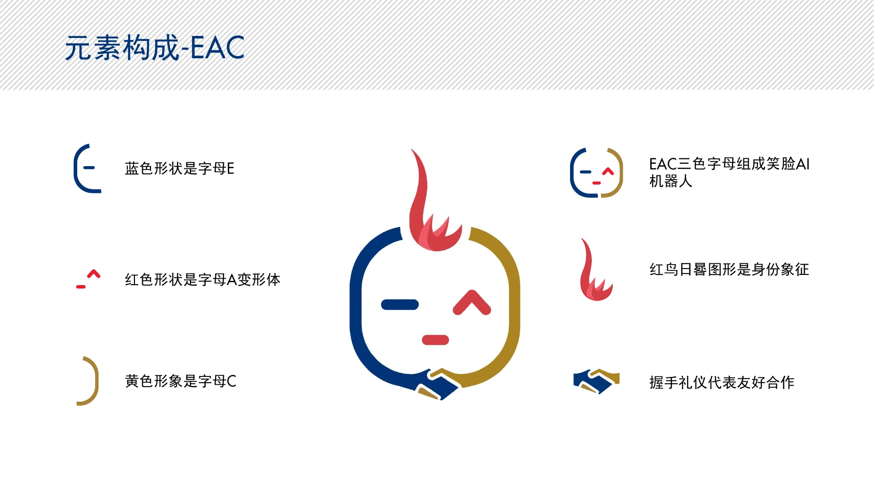
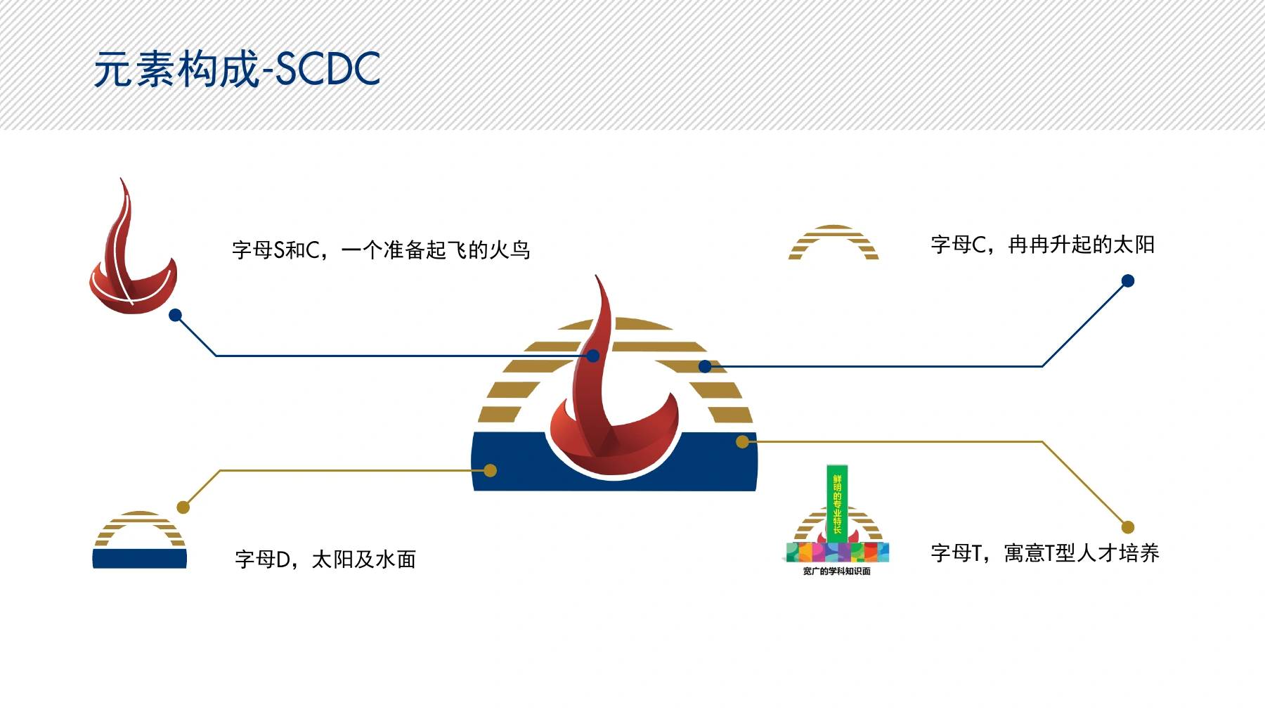
The design translates the committees’ different missions into distinctive visual identities while incorporating elements from the Red Bird sundial and university identity to maintain a connection with the institution.
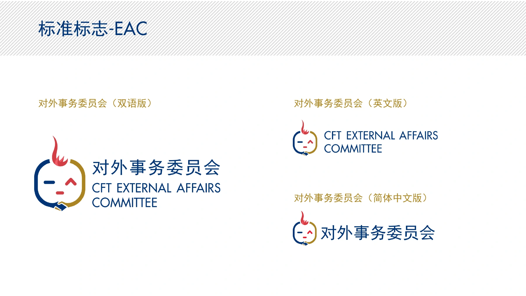
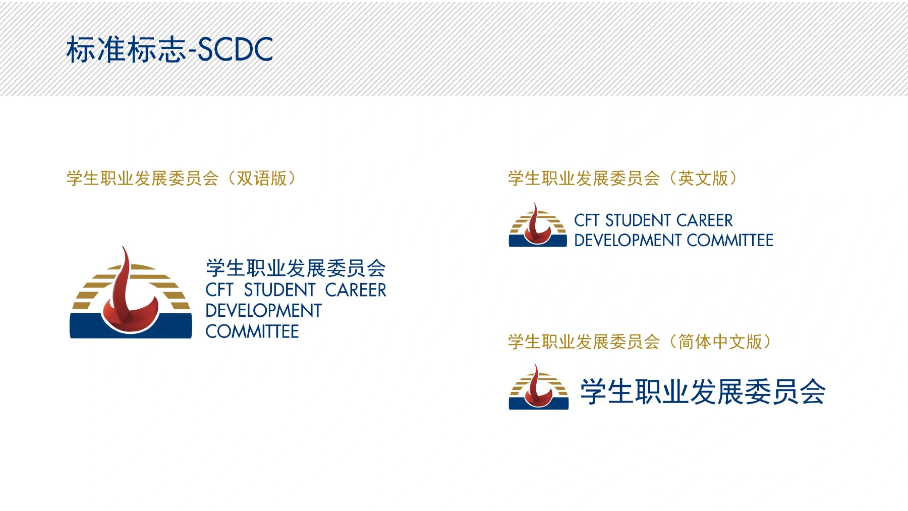
Deliverables include the logos, design concepts, element construction, language variants, university co-branding rules, typography, colour specifications and applications for envelopes, letterheads and business cards.
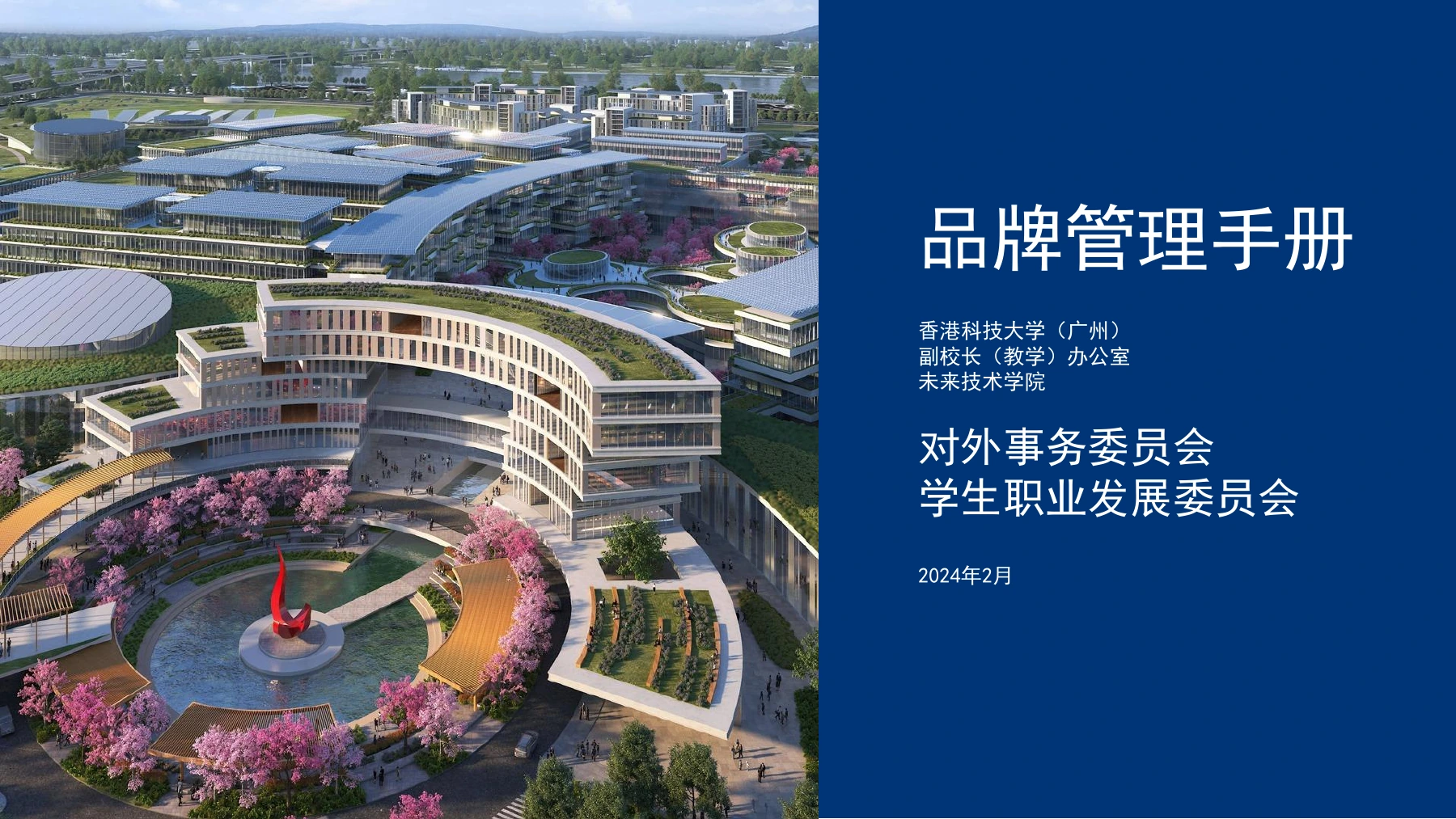
The 17-page handbook carries February 2024 on its cover and a March 2024 version note on its final page. The images in this case are original pages from the project handbook.
Two missions, two distinctive visual identities
The EAC identity transforms E, A and C into a blue, red and gold robot face. The Red Bird connects it to the university, the smile conveys friendliness, equality, respect and patience, and the handshake detail represents dialogue and collaboration.
The SCDC identity combines a Red Bird preparing for flight with a rising sun and water, incorporating the relationships between S, C, D and C. Its concept connects student growth, learning and future career development.
- Identity systems
- EAC — External Affairs Committee; SCDC — Student Career Development Committee
- Language variants
- Bilingual, English and Simplified Chinese versions for each identity
From identities to usable brand standards
The handbook defines placement, spacing and combinations when committee identities appear with the university logo, referencing the university brand guidelines to support consistent application.
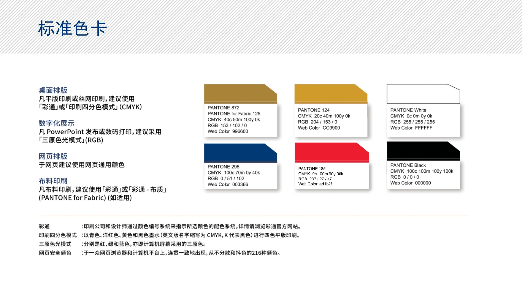
Typography uses Futura Medium for English and Heiti for Chinese. Colour guidance distinguishes CMYK printing, RGB digital display, web colours and fabric printing.
- Document deliverable
- 17-page brand management handbook; 2024 version
- Typography
- English: Futura Medium; Chinese: Heiti
- Colour system
- Pantone 872, 124, 295 and 185; white and black; CMYK / RGB / web specifications
- Co-branding
- Placement and spacing for university, college and committee identities
Bringing the identity into everyday use
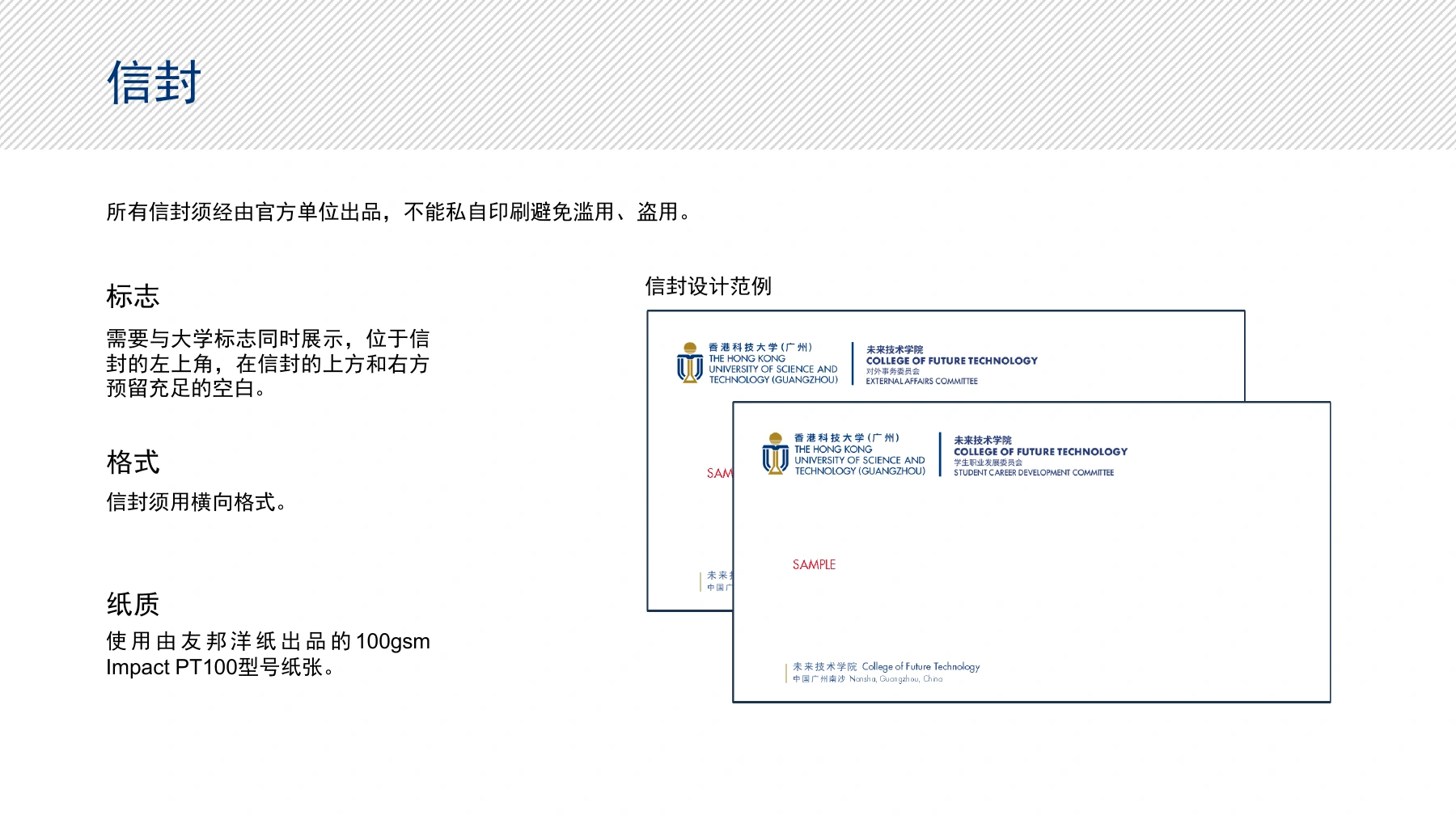
Envelope, letterhead and business-card layouts translate the identity rules into daily communication, specifying logo placement, information hierarchy, dimensions and paper choices.
This early project demonstrates the company’s ability to translate an organisation’s mission into a visual language and organise that language into a usable design system. Together with the later Firebird Hackathon brand experience and website development, it shows a practice spanning identity and digital products.
- Letterhead
- A4 portrait; 100 gsm Impact PT100 paper
- Envelope
- Landscape format; 100 gsm Impact PT100 paper
- Business cards
- 90 × 50 mm; 270 gsm Coronado sst CR682SS bright white, smooth paper
- Company scope
- Complete logo design, visual standards and brand handbook
这是 MY CREATIVE CENTER 的早期合作项目。公司为香港科技大学(广州)未来技术学院对外事务委员会(EAC)及学生职业发展委员会(SCDC)完成整套标志设计与品牌手册。
项目将两个委员会不同的工作使命转化为可辨识的视觉语言,同时融入红鸟日晷图形和大学标志的部分元素,保持与大学身份的联系。
交付不仅包含标志本身,也包含设计理念、元素构成、中英文版本、与大学标志并置的规范,以及字体、色彩和信封、信纸、名片的应用规则。
所展示的 17 页品牌手册以 2024 年2月为封面日期,末页标注 2024 年3月版本。本案例配图摘自项目手册原页。
两种使命,两套可辨识的视觉语言
EAC 标志把 E、A、C 三个字母转化为蓝、红、金三色的机器人笑脸。红鸟图形表达身份关联,微笑传递友善、平等、尊重与耐心,底部握手细节回应对外事务中的交流与合作。
SCDC 标志围绕准备起飞的红鸟、冉冉升起的太阳与水面展开,并将 S、C、D、C 字母关系融入构成。其理念连接学生成长、知识积累与职业发展的未来方向。
- 视觉识别系统
- EAC 对外事务委员会;SCDC 学生职业发展委员会
- 语言版本
- 每套标志均有双语、英文、简体中文版本
从视觉标识到可执行的品牌规范
手册明确委员会标志与大学标志一起展示时的位置、间距和组合方式,并参照大学品牌手册相关章节,使视觉应用保持一致。
字体采用英文 Futura Medium 和中文黑体;色彩规范区分印刷 CMYK、数字显示 RGB、网页颜色及布料印刷的使用场景。
- 文档交付
- 17 页品牌管理手册;2024 年版本
- 标准字体
- 英文:Futura Medium;中文:黑体
- 色彩系统
- Pantone 872、124、295、185;白与黑;CMYK / RGB / 网页应用规范
- 联合标志应用
- 大学标志、学院名称与委员会标志的排列及留白规范
让品牌进入日常使用场景
信封、信纸和名片的版式示例将品牌规则落实到日常沟通,明确标志位置、信息层级、尺寸及纸张选择。
这一早期项目展示了公司把组织使命转化为视觉语言,再将视觉语言整理为可持续使用的设计体系的能力。与后续火鸟黑客松的品牌体验及网站开发相衔接,形成从品牌识别到数字产品的实践积累。
- 信纸
- A4,纵向;100 gsm Impact PT100 纸张
- 信封
- 横向格式;100 gsm Impact PT100 纸张
- 名片
- 90 × 50 mm;270 gsm Coronado sst CR682SS 亮白、超滑纸张
- 公司负责范围
- 整套标志设计、视觉规范与品牌手册